Reading a wall label, line by line
What each line of a museum wall label means, from life dates and medium to height before width and the accession number, and how to read it after you look.

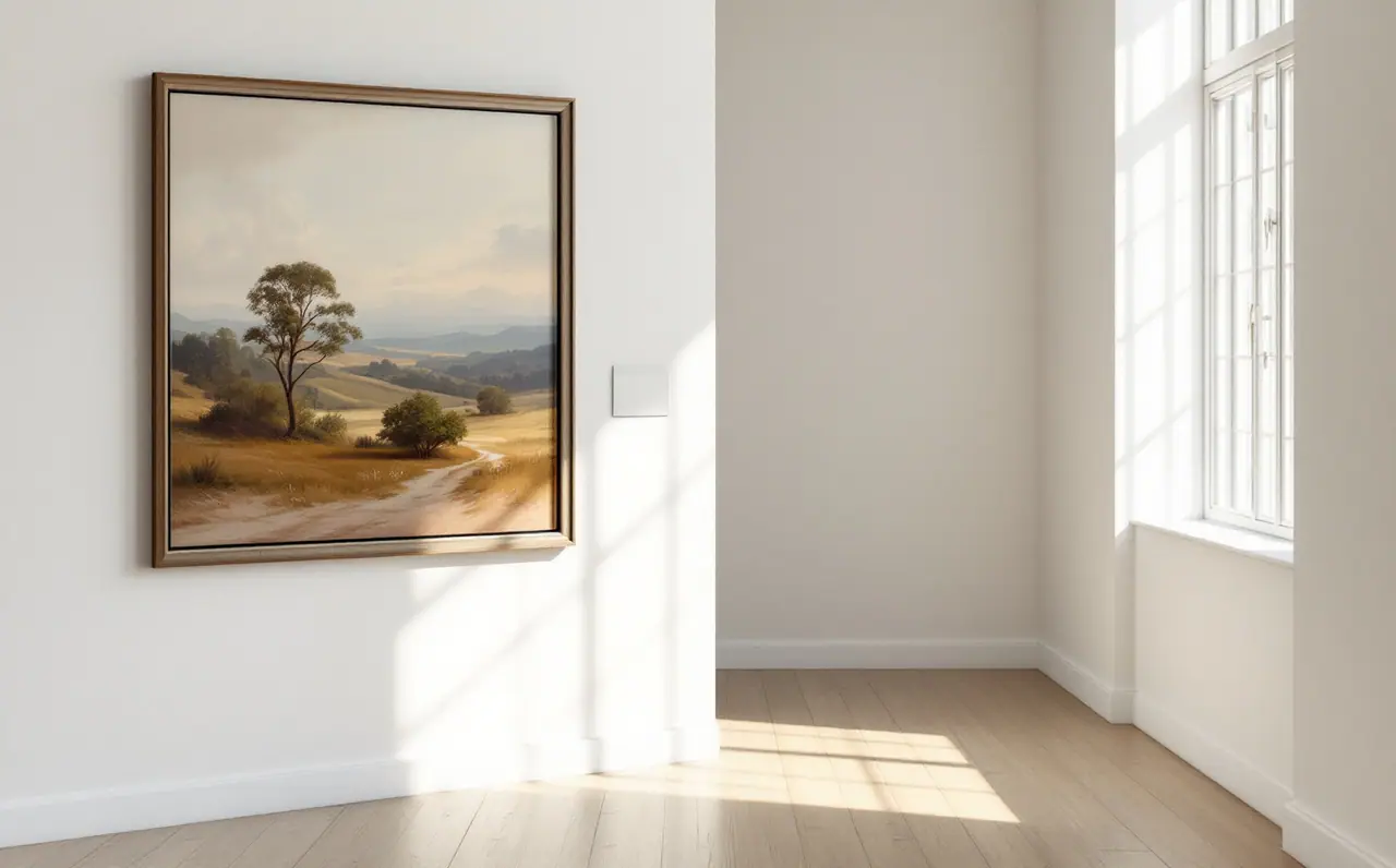
There is a small rectangle of card or vinyl beside almost every painting in a public gallery, and most of us read it before we have properly looked at the picture. I do it too. The eye goes to the words because words are easy, and a painting is not. But the label is a useful thing once you know how it is put together. Every line has a job, and most of those jobs are about facts you cannot get from the surface of the paint: who made it, when, from what, how big it really is, and how it came to hang on that wall.
This piece walks through a label one line at a time, then suggests a way of using it that keeps the painting in charge. It is written for the spring weeks when the light in the galleries changes and a lot of us go back to rooms we have not visited since winter.
A sample label to work from
Here is an invented label, laid out the way most Australian state and regional galleries do it. The artist is made up, so nothing here describes a real painting.
Agnes Coyle
Australia 1911 to 1988
Low tide, Ralphs Bay 1958
oil on composition board
61.0 x 91.5 cm
Purchased 1971
1971.42
Seven lines. Each one answers a different question.
Line one: the artist
The first line is the name, usually written the way the artist signed or was known. If an artist changed their name during their life, or worked under more than one, the gallery picks one and often gives the other in brackets. Some labels add a language group or community, especially for Aboriginal and Torres Strait Islander artists, where a line such as "Pitjantjatjara people" or the name of a community art centre tells you where the work comes from and who has the right to the stories in it. That line matters, and it is worth reading slowly.
Sometimes the first line is not a name at all. "Unknown artist" or "Attributed to" are honest answers. "Attributed to" means the curators think a particular person painted it but cannot be certain. "Circle of" or "Studio of" goes a step further away: someone close to the artist, or working under their direction.
Line two: where and when the artist lived
"Australia 1911 to 1988" gives the country the artist is associated with and their life dates. On the wall you will usually see a short dash between the years. Variations you will meet:
- "born 1974" or "b. 1974" means the artist is alive.
- "England 1850 to Australia 1920" shows a life that moved between countries.
- "active 1880s" or "fl. 1880s" means the birth and death dates are not known, but there is evidence of the artist working in that decade.
The life dates are more useful than they look. Put them next to the date of the painting and you can work out how old the artist was when they made it. In my sample, Coyle was 47 when she painted Low tide. That is the middle of a working life, not a student piece and not a late work, and it changes what you might expect to see.
Line three: title and date
The title is in italics. Titles have a strange status. Some were chosen by the artist, some were added by a dealer, a family member or a cataloguer later, and some works are simply Untitled. When a title appears in square brackets, it was given by someone other than the artist. A title can be a clue, a joke, a place name or a red herring, and it is worth reading it as one more piece of information rather than as an instruction.
The date follows the title. Common forms:
- "1958" means the work was made that year.
- "c. 1958" (circa) means about then.
- "1956 to 1958" means it was worked on across those years, often a sign of a painting that was revised.
- "1958, printed 1972" turns up on photographs and prints, where the image was made at one time and this particular sheet was produced later.
Line four: medium
This is where the label tells you what the object is made of, and it is the line I read most carefully. "Oil on canvas" is the familiar one, but look out for the support as much as the paint. "Composition board" or "hardboard" means a rigid panel, which many Australian painters used in the middle of the twentieth century because it was cheap and available. Paint on board behaves differently from paint on canvas: it sits flatter, there is no give, and you often see the brush dragged across a hard surface.
Australian public galleries tend to write "synthetic polymer paint" where you might expect "acrylic". They are describing the same family of paints. You will also see "natural earth pigments on bark" or "on canvas" for many Aboriginal works, "gouache", "watercolour and pencil", or a long list for mixed media works where the artist has added sand, collage or found materials.
For prints, the medium line names the process: etching, lithograph, screenprint, woodcut. If you want to understand what those words mean and why an edition number sometimes appears here as well, prints and editions explained covers the vocabulary.
Line five: dimensions
"61.0 x 91.5 cm" is height first, then width. That convention is close to universal in museums, and it is the single most useful thing to know about a label, because it tells you the orientation without your having to look. This one is wider than it is tall, a horizontal picture, which suits a title about a bay at low tide.
A third number means depth, which matters for sculpture and for thick or boxed canvases. For works on paper, labels may give "sheet" (the whole piece of paper) and "image" or "plate" (the printed or drawn area) separately. Some galleries measure the work unframed and some give framed sizes too. If the label does not say, assume unframed.
Dimensions are also a check on your own eyes. Reproductions in books and on screens make everything the same size, and it is a real surprise to discover that a painting you know well is the size of a dinner tray, or as wide as a car.
Line six: the credit line
"Purchased 1971" tells you how the work entered the collection and when. Other credit lines you will see:
- "Gift of" followed by a name, often with a year.
- "Bequest of", which means the work came from someone's estate.
- "Donated through the Australian Government's Cultural Gifts Program", a scheme that encourages gifts of significant objects to public collections.
- "Purchased with funds provided by" a foundation, a society or a group of supporters.
- "On loan from a private collection", which means the painting does not belong to the gallery and may leave again.
I find credit lines quietly moving. They are a record of decisions: a curator who argued for a purchase, a family who decided a painting should be seen by strangers rather than kept in a hallway. They can also tell you something about taste at a moment in time. A painting bought by a state gallery within a few years of being made was considered important by someone, early.
Line seven: the accession number
The last line is usually a string of numbers, sometimes with letters. This is the accession number, the work's unique identifier in the collection. Many galleries start it with the year of acquisition, so "1971.42" would be the 42nd item recorded that year, but systems vary and older collections often use other formats. You do not need to decode it. It is useful in one practical way: if you want to find the work again in the gallery's online collection, typing the accession number into the search box usually takes you straight to it.
The longer text, and when to read it
Many labels now come with a paragraph or two of interpretation underneath, and some rooms have a wall text that introduces the whole space. These are written by curators and educators, and the good ones are short, specific and point you back at the painting. The weaker ones tell you what to feel.
My rule is to read the extended text last. The seven short lines are facts. The paragraph is someone's reading, and it is hard to unsee another person's reading once you have taken it in. Give your own eyes the first go.
A ten-minute routine that keeps the painting first
This is the routine I use, and it is a cousin of the longer method in how to look at a painting slowly.
- Minutes one to four: Look at the painting without reading anything. Stand back, then go close. Notice the edges, the surface, where your eye goes first.
- Minute five: Guess the medium and the date. Is it oil or something flatter? Old or recent? Board or canvas? You will often be wrong, and that is the point.
- Minute six: Read the seven short lines. Compare them with your guesses. Where were you surprised?
- Minutes seven to nine: Look again with the label in mind. If it says board, look for the drag of the brush. If the life dates tell you this was a late work, look for what might have loosened or tightened.
- Minute ten: Now read the longer text, if there is one, and see whether it matches what you found.
Worked through on my invented example: in the first minutes you might notice a long horizontal format, wet sand painted in thin grey and brown, a band of pale sky. You guess oil, maybe on canvas, maybe the 1960s. The label tells you board, 1958, an artist in her late forties. On a second look the flatness makes sense, the brush skips over the hard surface in the sand, and the title gives you the place. Ten minutes, and the label has added to the painting instead of replacing it.
A few habits worth keeping
Carry a small notebook and copy the medium and dimensions of works that stay with you. Over a few months you build a private sense of scale and material that no reproduction can give you. When a label surprises you, ask yourself why: the surprise is usually telling you something about the assumptions you walked in with.
And when you are in a room with nothing to read at all, as happens in some contemporary installations and in plenty of commercial shows, enjoy it. You were always the one doing the looking. The label is a companion for the second look, which is generally the better one. More pieces on how to spend time with pictures live in the Looking closely room.

Ottilie Ellwood
Ottilie Ellwood writes about looking slowly, art history and the books worth keeping on the shelf. She lives in Hobart and reads exhibition catalogues the way other people read novels.
In the same room
Reading an Australian landscape painting
How Australian painters have handled light, distance and the horizon, from Heidelberg plein air to the aerial view, and how to read the marks on a canvas.
How to look at a painting slowly
A simple, unhurried method for spending ten to twenty minutes with one painting, from first impressions to the label, with a worked example to try.