Prints and editions explained, from etchings to inkjet
What makes a print original, how etchings, lithographs and screenprints differ, what 12/30 and A/P mean, and what a certificate for a print should say.

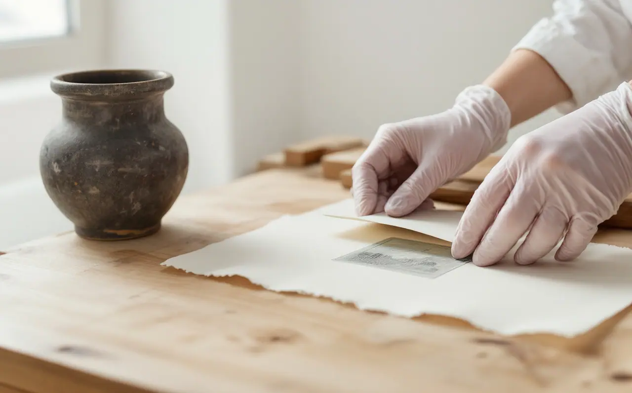
Most of the art in my Brisbane hallway is prints, and almost every visitor asks the same question about them: "Is that a real one?" It is a fair question, because the word "print" covers two very different things. One is an original print, made by an artist working on a plate, block, stone or screen, where the printed sheet is the artwork. The other is a reproduction, a photographic copy of an artwork that already exists in another form. Both can be lovely on a wall. They are not the same object, and a seller should never let you confuse them.
This piece sorts out the main printmaking methods, the numbers and letters pencilled in the margin, and the paperwork that should come with a print. If you are buying a first work, prints are one of the friendliest ways in, and knowing the vocabulary makes the conversation at the counter much easier.
Original print or reproduction
An original print starts with a matrix: a copper plate, a block of wood, a slab of limestone, a stretched screen. The artist (often working with a specialist printer) makes marks on that matrix, inks it and presses paper against it. Each sheet pulled is an impression. Because the image only exists through that process, every impression is an original, and small differences between them are normal.
A reproduction starts with a finished artwork, usually a painting, which is photographed or scanned and then printed, often by offset lithography or inkjet. The artist may sign it, and it may be numbered, but the image was not conceived for the press. A signed reproduction is still a reproduction.
There is a third case that causes most of the muddle, and I will come back to it: prints made digitally by artists who work on screen from the start.
The main methods, side by side
| Method | How the image is made | What to look for |
|---|---|---|
| Etching (and other intaglio, such as drypoint and aquatint) | Lines are bitten into a metal plate with acid, or scratched directly. Ink sits in the grooves and is pressed out onto damp paper. | A plate mark, the slight embossed rectangle where the plate edge pressed into the sheet. Lines that sit a fraction above the paper surface. |
| Lithograph | The artist draws on stone or a plate with a greasy material. Grease attracts ink and water repels it, so only the drawn marks print. | Flat ink with a crayon or wash texture. No plate mark and no raised surface. |
| Screenprint | Ink is pushed through a fine mesh, with a stencil blocking the areas that stay blank. Each colour usually needs its own screen. | Dense, even areas of flat colour with crisp edges, sometimes a slight layering where colours overlap. |
| Woodcut | The artist cuts away the wood around the image, then inks the raised surface. | Bold shapes, sometimes the grain of the plank printing through as fine stripes. |
| Linocut | Like woodcut, but cut into linoleum, which is softer and has no grain. | Strong, even blacks and smooth curves, often a faint gouge texture in the cleared areas. |
| Monotype | The artist paints or rolls ink onto a smooth plate and prints it once. | Painterly marks, and only one strong impression. A monotype is unique, so it is not editioned. |
A loupe or a cheap magnifying glass helps a great deal here. Under magnification, a reproduction made by offset printing shows a regular pattern of tiny dots, while a lithograph or screenprint shows continuous marks or solid ink. An etching shows ink sitting in the paper rather than on top of it. I keep a small folding loupe in my bag for exactly this, and nobody has ever minded me using it.
Plenty of Australian painters known for big canvases also made prints, and seeing both side by side shows how close printmaking sits to drawing. John Olsen, the subject of the site's essay on his life and work, made etchings and lithographs alongside his paintings, and his prints carry the same quick, wandering line.
Reading the margin
Most original prints carry pencil notes in the lower margin. The convention (not a law, and printmakers vary) is a number on the left, a title in the middle and the signature on the right.
Edition numbers
A number such as 12/30 means this is impression 12 of an edition of 30. The edition size is the total number of numbered impressions the artist decided to print, after which the matrix is usually cancelled or retired. The first number is not a ranking. In many printing processes impression 28 is just as good as impression 3, because sheets are not necessarily numbered in the order they came off the press.
What matters more is that the edition is closed and stated. "Edition of 30" tells you something definite. "Limited edition" with no number tells you almost nothing.
Proofs and other letters
Alongside the numbered edition, you will see some other marks:
- A/P or AP (artist's proof, sometimes E.A. for épreuve d'artiste): impressions kept by the artist outside the numbered edition. A common convention is a small number, often around a tenth of the edition size. They are usually identical to edition impressions.
- P/P (printer's proof): an impression given to the printer who worked on the edition.
- B.A.T. (bon à tirer, "good to print"): the approved impression the printer matches the rest of the edition against. There is usually only one.
- H.C. (hors commerce): impressions marked as not for sale, often used for exhibition or archive.
- T.P. or trial proof: an impression pulled while the image was still being worked out, which may differ from the final edition.
None of these letters makes a print more or less "real". They tell you where the sheet sits in the making of the edition, and an honest seller will explain them without fuss.
Chop marks and blind stamps
Many workshops and some artists press a small embossed seal into the margin, known as a chop or blind stamp. It carries no ink, so you see it best with light raking across the paper. A chop tells you which workshop printed the edition, which can help with records later. Its absence does not mean a print is suspect; plenty of artists print their own work without one.
Giclée, inkjet and honest descriptions
"Giclée" is a word I would like to see retired. It simply means a high-quality inkjet print, and it gets attached to everything from a carefully made pigment print by an artist who works digitally to a quick copy of a painting printed on canvas. The word itself tells you nothing about which one you are looking at.
There is nothing wrong with inkjet as a process. Pigment inkjet printing on good cotton paper can be very stable, and many artists now make work that only exists digitally until it is printed. If an artist made an image on screen, approved the proofs and editioned the result, that print is an original digital print.
The honest question is always: what was the artwork in the first place? A clear description might read "pigment inkjet print on cotton rag paper, edition of 20, signed and numbered" for an original digital work, or "inkjet reproduction of an acrylic painting, open edition" for a copy. If a description avoids saying which, ask.
What a certificate should say
A certificate of authenticity is only as useful as the details in it. A loose card with a signature and the word "authentic" adds very little. A useful one, whether it comes from the artist, a workshop or a publisher, should state:
- The artist's name and the title of the work.
- The year the matrix was made and the year it was printed, if different.
- The medium in plain words (for example "etching and aquatint", "four-colour screenprint", "pigment inkjet print").
- The paper, and the image and sheet sizes in centimetres.
- The edition size, the number of this impression, and how many proofs exist outside the edition.
- The printer or workshop, if not the artist.
- Whether the matrix has been cancelled or retired.
Keep it with your receipt in a plastic sleeve, not taped to the back of the frame, where it tends to get damp or lost. I have a ring binder for mine, which is less romantic than it sounds and much more useful.
A worked example: reading one label
Say a print in a show has this room sheet entry:
Screenprint on Somerset paper, 2019. Image 45 x 60 cm, sheet 56 x 76 cm. Edition of 25, plus 3 A/P. Printed by the artist.
Here is what that tells you. It is an original print, not a reproduction, because the medium is a printmaking process and the artist did the printing. The image area is a bit smaller than the paper, which is normal, and the white border will matter when it comes to framing. There are 28 impressions in total: 25 numbered, 3 artist's proofs. Nothing says whether the screens have been cleaned off, so that is a fair question to ask.
If the pencil margin on the sheet itself reads "7/25" on the left and is signed on the right, it matches the label. If it reads "A/P", it is one of the three proofs and otherwise the same.
Before you take it home, look at the margins for creases, foxing (small brown spots) or tape residue, and check that the colour is even across the sheet. Then read framing works on paper before choosing a mat, because a print hinged badly in an acidic frame is where most of the damage I see begins.
Questions to carry with you
When you see prints in a show (the guide to visiting Sydney exhibitions has more on reading room sheets), a short list of questions covers most situations. What is the process? Who printed it? How big is the edition, and how many proofs are there outside it? Is the matrix retired? Is this an original image or a copy of a painting? Can I see the certificate?
A good seller will answer each one easily, and the answers will make the print in your hallway a better story when the next visitor asks if it is a real one.
For the wider picture of budgeting and choosing a first work, buying your first original artwork covers the ground before the print counter.

Jasper Quayle
Jasper Quayle writes for people buying their first original work: budgets, editions, certificates and the questions worth asking before paying. He lives in Brisbane, where his hallway is mostly prints and picture hooks.
In the same room
Collecting photographs as art without getting lost in the jargon
Editions and sizes, silver gelatin, chromogenic and pigment prints, signatures and labels, light and framing: a plain guide to living with fine art photography.
Buying your first original artwork, step by step
A calm, step-by-step guide to buying a first original work: setting a budget, where to look, what to ask, and the paperwork, payment and delivery that follow.